Sunday, April 26, 2015

Day 103: Finishing the Mockups

Yesterday I got as far as working on the 3rd mockup.  When I woke up this morning, in the half hour before I woke up, My thoughts were on that last mockup I did, and I had a dream that a part of the mockup was incorrect (the status update box).  Sure enough, I walked over to my mac after making my bed, and there it was, the error.  So I fixed that up already.

Ok, I finished the mockups and exported them to a pdf!


Pretty cool!  Balsamiq is amazing!

O.k., so next, my task is to do a design teardown for every one of these pages.  Once I'm done with that, I need to upload them to github and send a pull request, and then I can finish up reading the last three chapters of the design module (the last three chapters review/summarize what we already covered, they wrap-up the module).

SUMMARY OF CODING SKILLS

Total Treehouse Points: 5,385

Treehouse Points by Subject Matter (Miscellaneous not included): 
HTML:                                663 
CSS:                                1,599 
Design:                            1,193 
Development Tools:            747 
Javascript:                      1,120

Treehouse Ranking (%): "You have more total points than 94% of all students."

Treehouse Badge(s) Earned Today:


Treehouse Courses Completed:
How to Make a Website
HTML
CSS Foundations
CSS Layout Techniques
Aesthetic Foundations
Design Foundations
Adobe Photoshop Foundations
Adobe Illustrator Foundations (66% complete, switched focus from web design to web dev)
Git Basics
Introduction to Programming
Javascript Basics

Codecademy (& other) Courses Completed:
HTML and CSS (Codecademy) 

Books Read or in Progress:

Completed: "Head First HTML and CSS," by E. Robson & E. Freeman
In Progress: "Eloquent JavaScript," by Marijn Haverbeke (On pg 27)
In Progress: "Head First Javascript," by Eric Freeman and Elisabeth Robson (On pg 56)
In Progress: "A Smarter Way to Learn Javascript," by Mark Myers (on pg 72)

My Progress on The Odin Project:
1.  Introduction to Web Development             100% Complete
2.  Web Development 101                                29% Complete
3.  Ruby Programming                                       0% Complete
4.  Ruby on Rails                                               0% Complete
5.  HTML5 and CSS3                                           0% Complete
6.  Javascript and JQuery                                  0% Complete
7.  Getting Hired as a Web Developer                 0% Complete

Hours Spent Coding Today: 4
Total Hours Coding: 488

Saturday, April 25, 2015

Day 102: Visual Hierarchy Sketches and Balsamiq Mockups for Facebook

These are the tasks I am now working on:

0.  Facebook UX teardown (already completed, so this is task 0).
1.  Design teardowns for the Facebook Home Page, News Feed, Profile, About, and Photos Page.  This includes sketches of the visual hierarchy for every page listed above.
2.  Balsamiq Mockups for Facebook Home Page, News Feed, Profile, About, and Photos Page. 
3.  Upload # 2 and # 3 to Github

I'm looking forward to getting a lot of things done today, and these tasks are going to require a lot of focus to get completed and to stay organized.  So, I'm going to start my Saturday off by drawing the visual hierarchy for each of the required pages by hand.  Once that's done, I'll do the mockups for all five of the required pages on Balsamiq and save the files as pdf's (so that when I upload them to github, people without Balsamiq are capable of viewing them), and then, after that, I'll write up the design teardowns, organize all my work, including the Facebook UX teardown, which I've already completed, and load it all up to github, then send a pull request to the Viking Code School, and be done with the module.

Whew!


Facebook UX Teardown

  1. Who is the main user of Facebook?
    Every literate man, woman, and child on earth with friends and acquaintances. The site is not designed to be optimal for loners.
  2. What are the top 3 critical goals for that user?
    The first is to see what friends are up to in their personal lives, the second is to update friends on what the user is up to in their personal life, and the third is to consume/share miscellaneous media content, be it news, makeup tips, music videos, etc.
  3. What is the site's approximate information architecture? (in general -- don't get caught up in the details too much)
    The user logs in via the landing page, then is taken to a feed which contains updates from friends as well as ads targeted at them and allows the user to create posts for friends to view. This feed is flanked to the side by many links to news, events, more ads, groups the user is a member of, and apps, for example. Above the feed, we have a navigation bar, which includes a search bar, a link to the user's personal page, a link to the home page, a link to find friends, and other links for various purposes such as to check on friend requests received and to adjust privacy settings. The information architecture for this web application is not a simple hierarchical chart, it's more like a never-ending series of spiderwebs connected to many other spiderwebs, with the login page at the center of each user's web.
  4. For your top user goal, what is likely to make the user's experience particularly satisfying?
    Seeing the most important updates from friends on the home page.
  5. To accomplish this goal, how does the user flow through the site's architecture? (ie. which pages are visited and what are clicked?)
    On the landing page, the user enters their userid and password and clicks on the Login link. That's it, one click, and the user is taken straight to the home page feed which provides content created or shared by the user's friends (as well as ads). The content is organized based on the relative importance to the user, determined by the user's actions on the site and the interactions thereof with Facebook's algorithms for determining the most desirable content for that user.
  6. What style(s) of navigation is/are used? Do they answer the two key questions (Where am I and how did I get here? Where should I go next and how do I get there?)?
    The primary links which serve to orient and guide the user through the site are in the horizontal navigation bar on top of every page. The Home link does not remain highlighted when the user is on the home page, and the same goes for the other links in the navigation bar, so no, the user does not know where they are, unless they are familiar with the site, and there is also no trail showing the user how they arrived at their current destination. Facebook does not really guide you as to where to go next or how to get there. In that sense, it is similar to an open world video game in that users are free to go anywhere they would like to go. It is very easy to become immersed in Facebook, bouncing from a friend's post, to a news article, to the profile of a person that commented on a post or article, to a profile of a friend of that person's, and so on and so forth. The loose, relatively unrestrictive information architecture of Facebook encourages the user to roam freely, consuming the limitless amount of user-generated/shared content, while simultaneously being served targeted ad content provided by Facebook's clients. If the information architecture was streamlined, the user would log on, retrieve the information the user needed, and then log off quickly. That expeditious use of the site would not be ideal for advertisers and would adversely affect ad revenue for Facebook, so the lack of clarity in regards to site navigation helps Facebook's business model.
  7. What does Facebook do well to allow the user to accomplish the top goal effectively, efficiently and with good satisfaction?
    The home page feed gives the user the content the user desires to consume. It accomplishes this through the interaction of the user's actions on the site and Facebook's algorithms (and certain user-modifiable settings).
  8. What does Facebook do poorly when allowing the user to accomplish the top goal effectively, efficiently and with good satisfaction?
    The ads. The ads are inserted into the user's feed and get in the way of the user viewing their friends' content. That said, the ads keep Facebook in operation, so people understand and are willing to continue using the product despite the distraction they create from the user's top goal of getting updates on their friends' personal lives. This cooperation by the user is aided by Facebook making the ads as unobtrusive as possible (designing them to have much the same look and feel as the rest of the site) and attempting to make the ads relevant to the user.

I've got quite a day ahead of, let's go!  :)


O.k. I'm done sketching the Facebook pages, and now I'm working on the Balsamiq mockups, and guess what?  There's a "site map" icon/feature in Balsamiq that lets you enter the information architecture via text and it will draw the information architecture boxes out for you.  Man.  That one would have come in useful in the last couple of days as I was hand-crafting information architecture for various sites.

The more you know.

O.k., back to the mockups. 


I got up to half of the third one, so I'm halfway done.  I was very detailed with my mockups, but Trautman did mention we don't have to be, so it's not required, but I just really enjoyed working with Balsamiq, and by actually doing the detail work, I learn more and more about how to use the tool because more situations come up and I then have to figure out ways to get the tool to do what I want it to do.  It's an amazing tool.  I'm more impressed by it every day.  O.k., time to sleep.

SUMMARY OF CODING SKILLS

Total Treehouse Points: 5,385

Treehouse Points by Subject Matter (Miscellaneous not included): 
HTML:                                663 
CSS:                                1,599 
Design:                            1,193 
Development Tools:            747 
Javascript:                      1,120

Treehouse Ranking (%): "You have more total points than 94% of all students."

Treehouse Badge(s) Earned Today:


Treehouse Courses Completed:
How to Make a Website
HTML
CSS Foundations
CSS Layout Techniques
Aesthetic Foundations
Design Foundations
Adobe Photoshop Foundations
Adobe Illustrator Foundations (66% complete, switched focus from web design to web dev)
Git Basics
Introduction to Programming
Javascript Basics

Codecademy (& other) Courses Completed:
HTML and CSS (Codecademy) 

Books Read or in Progress:

Completed: "Head First HTML and CSS," by E. Robson & E. Freeman
In Progress: "Eloquent JavaScript," by Marijn Haverbeke (On pg 27)
In Progress: "Head First Javascript," by Eric Freeman and Elisabeth Robson (On pg 56)
In Progress: "A Smarter Way to Learn Javascript," by Mark Myers (on pg 72)

My Progress on The Odin Project:
1.  Introduction to Web Development             100% Complete
2.  Web Development 101                                29% Complete
3.  Ruby Programming                                       0% Complete
4.  Ruby on Rails                                               0% Complete
5.  HTML5 and CSS3                                           0% Complete
6.  Javascript and JQuery                                  0% Complete
7.  Getting Hired as a Web Developer                 0% Complete

Hours Spent Coding Today: 6
Total Hours Coding: 484

Friday, April 24, 2015

Day 101: NYT, TMZ, Huffington Post, and Medium Design Teardowns

All right, it's 3:30 a.m. I got a good 6.5 hours of sleep in, and I normally prefer 8, but I feel well rested, so I'm waking up early to get a lot of work done!  Here's an outline of the tasks I'm working on:

1.  Design teardowns for NY Times, TMZ, The Huffington Post, and Medium.

2.  Design teardowns for the Facebook Home Page, News Feed, Profile, About, and Photos Page.
3. Balsamiq Mockups for Facebook Home Page, News Feed, Profile, About, and Photos Page.  This includes visual hierarchy sketches or mockups for Facebook Home Page, News Feed, Profile, About, and Photos Page.
4.  Upload # 2 and # 3 to Github

Design Teardowns for NY Times, TMZ, The Huffington post, and Medium


New York Times Design Teardown

1. Go to each of the sites below and immediately squint your eyes so you can't really see what they say.

2. Sketch on a sheet of paper what the approximate visual hierarchy looks like -- what areas are denser and what areas are more sparse?
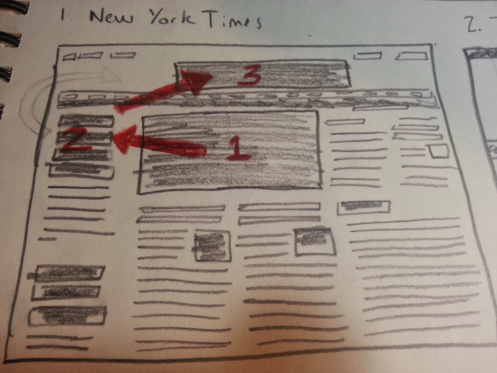


The main image is the most dense part, to the left of that is the heading for the main image, and then after that, the eye is drawn to the New York Times logo/heading..

3. Open your eyes and ask yourself "who is the user?"

Someone who is interested in keeping up with important news, with a New York Times slant to it.

4. What is the user's critical goal? (or at least what do you think the site owner wants them to do?)

Reading the most important news, as filtered by the New York Times.

5. Does the visual hierarchy you sketched lead to that goal?

Yes.  The most important story has a picture next to it which gives an idea of what the story is about, and then the story's title is in a large font.

6. What font families are most prominent on the site? (use the WhatFont add-on or your browser's developer tools to inspect this).

nyt-cheltenham-bold, nyt-franklin-regular, nyt-georgia-regular, and nyt-karnak-display-130124-regular.

7. How do these font families contribute to or take away from the site's flow?

The size of the font and the boldness of it or lack thereof guide the user visually towards the stories the NYT wants to highlight.  The fonts go well with each other, except for karnak, but perhaps that is intentional.  I mention that because that section highlights links to other stories, some of which take the user outside of the NYT website, so using karnak, very different from the other fonts, may have been used to imply the difference between the "Watching" section of the main page and the rest of the main page.

8. How do the line spacings, sizes, colors and weights contribute to or take away from the site's flow?

They give the site an aesthetic cohesiveness, create high readability, and highlight desired stories/sections.  The site has a nice flow, it puts the reader at ease and conveys legitimacy.

9. What would you improve to achieve a better hierarchy or flow?

I would remove the "Watching" section.  That section provides links to news from a couple of minutes ago, in a continuously updating feed.  The thing with that is that that's what twitter and similar sites are for.  The NYT, if I go to their site, I don't want, let's call it, "yelping chihuahua news," I want, "distinguished great dane" news, if that makes any sense.  In other words, Twitter and similar sites are for raw snippets of news coming from many unpolished sources.  On the other hand, from the New York Times, I expect a finished product, and I am o.k. with waiting a week or so to get it, so that the story has been fleshed out more fully.

TMZ Design Teardown

1. Go to each of the sites below and immediately squint your eyes so you can't really see what they say.

2. Sketch on a sheet of paper what the approximate visual hierarchy looks like -- what areas are denser and what areas are more sparse?
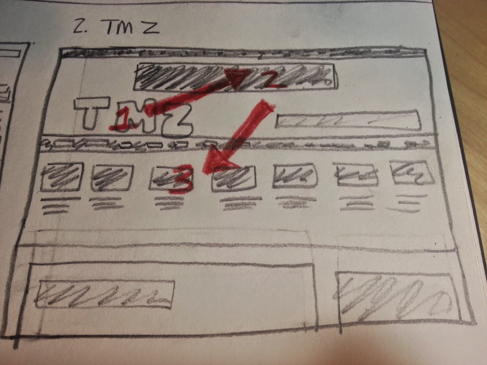


The logo is the most dense, followed by the ad on top, and then the images below the logo.  Not too much is sparse, there's a lot of things going on in the page, perhaps too many things.

3. Open your eyes and ask yourself "who is the user?"

People that like to read about celebrity gossip.

4. What is the user's critical goal? (or at least what do you think the site owner wants them to do?)

Reading the latest and most important celebrity gossip.

5. Does the visual hierarchy you sketched lead to that goal?

No.  The visual hierarchy leads to the logo, then to a large banner ad, then to many different images linking to lots of celebrity gossip stories.  The most important celebrity gossip story is almost an afterthought at the bottom of the page, which, if the user's viewport is not large enough, the user will have to scroll down to see it.  That's not good as the most important story should be "above the fold."

6. What font families are most prominent on the site? (use the WhatFont add-on or your browser's developer tools to inspect this).

Sans Pro - regular and Sans Pro - 600.

7. How do these font families contribute to or take away from the site's flow?

Using the same font family does give the site consistency.  The flow is somewhat scatter-brained, though, there's just too many things trying to get my attention, and the ads are competing with the content.

8. How do the line spacings, sizes, colors and weights contribute to or take away from the site's flow?

They attempt to convey to the user what is important, but since that means the important items are the large logo on the upper left and the banner ad on top, I don't think the spacings, sizes, colors, and weights help the user achieve their critical goal efficiently.

9. What would you improve to achieve a better hierarchy or flow?

I would completely redesign this website.  It does not have a clean look, there's simply too much going on, and there's a lot of space that could be used more efficiently.  I'm not a fan of this site's design.  I mean, it works, I just think it could be improved upon substantially.  I would remove the banner ad on top and I would not have an image next to every one of the stories above the main story.  Instead, I would move the main story up on the page, above the fold, and then move all the smaller stories below the main story, with or with out pictures for the smaller stories (probably without, but if TMZ's readers really, really like pictures, then including a picture with every story, even the smaller ones, could make sense).

Huffington Post Design Teardown

1. Go to each of the sites below and immediately squint your eyes so you can't really see what they say.

2. Sketch on a sheet of paper what the approximate visual hierarchy looks like -- what areas are denser and what areas are more sparse?
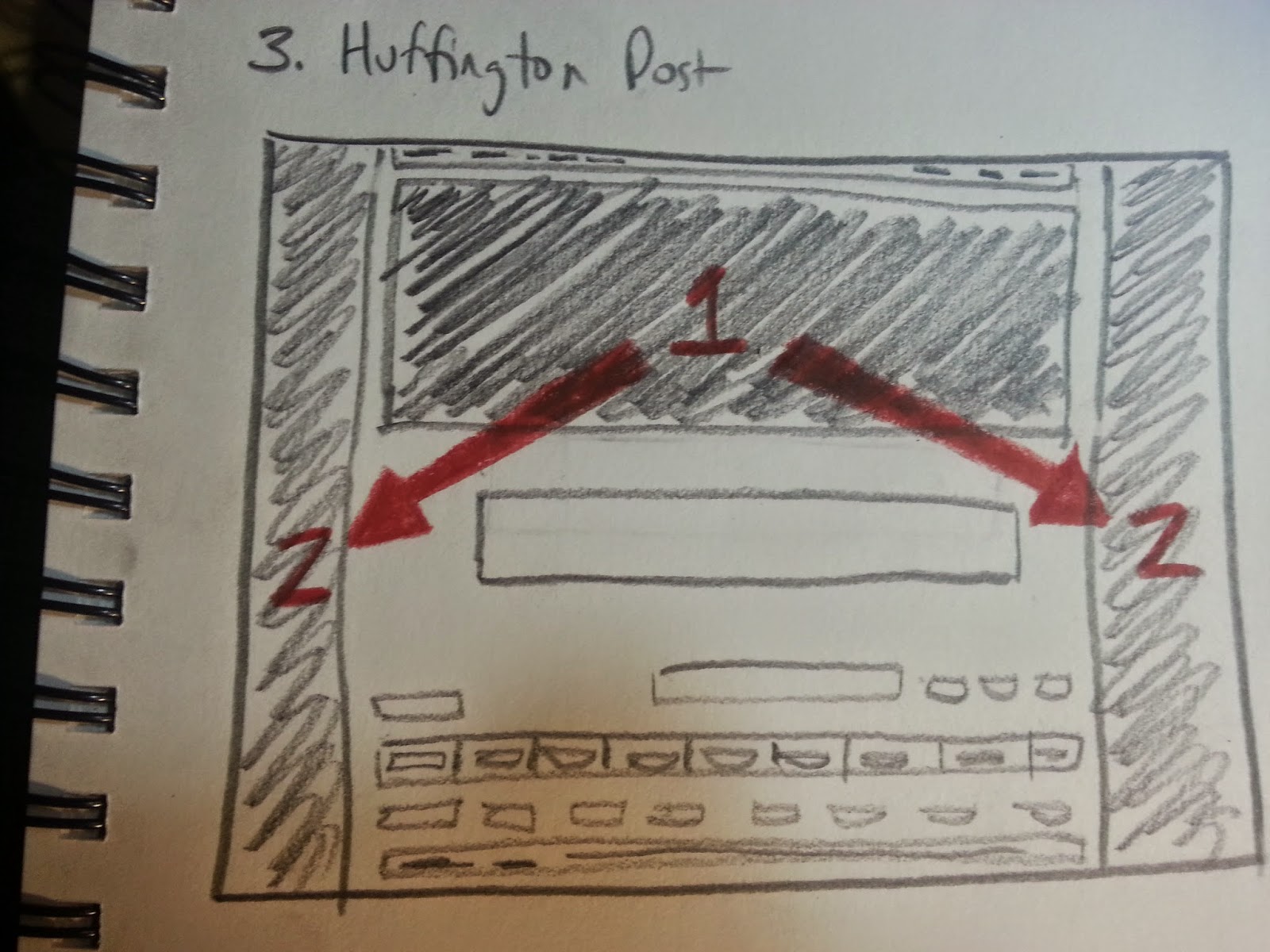


The densest areas are areas 1 and 2, where the ads are.  The more sparse areas are below, where the news should be, but where there is primarily white space.

3. Open your eyes and ask yourself "who is the user?"

People that want to read the most important news, with a Huffington Post vibe to it.

4. What is the user's critical goal? (or at least what do you think the site owner wants them to do?)

Reading the most important news, as filtered by the Huffington Post.

5. Does the visual hierarchy you sketched lead to that goal?

Absolutely not.  The visual hierarchy leads the user to a giant ad at the top and very loud (visually speaking) ads on the right and left borders of the page.  It is hard to find any news at all on this page.  The main story is below the fold and only a part of the main story's headline is visible above the fold.

6. What font families are most prominent on the site? (use the WhatFont add-on or your browser's developer tools to inspect this).

Arial, Arial - bold, serif - regular, Georgia, and OpenSansCondensed.

7. How do these font families contribute to or take away from the site's flow?

They do go well with each other, contributing to the flow, but they are simply overshadowed by the ads.  The may not even get to the fonts before he closes out the page to escape from the gigantic ads.

8. How do the line spacings, sizes, colors and weights contribute to or take away from the site's flow?

The combination of line spacings, sizes, colors, and weights is aesthetically pleasing, except that the ads completely overshadow the entire experience, making all the work put into the actual displaying of the news a moot point.

9. What would you improve to achieve a better hierarchy or flow?

I would make the ad on top vertically smaller, or better yet, remove it entirely, so as to move the main story above the fold.  Inserting ads discretely may serve the newspaper's business better in the long run.  I would focus on the news.  People come to this site to read the news, not to see ads, and the user's critical goal should be reflected in the design of the site.  If it is hard to get to the actual news, I don't think people will return frequently, which means the newspaper will not be able to get as much for placing ads, which means the quality of the newspaper's content will go down due to decreased funds available for hiring journalists, leading to a loss in readership, leading to lower market values for ads, leading to less funds available to hire journalists, and so on and so forth.

Medium Design Teardown

1. Go to each of the sites below and immediately squint your eyes so you can't really see what they say.

2. Sketch on a sheet of paper what the approximate visual hierarchy looks like -- what areas are denser and what areas are more sparse?
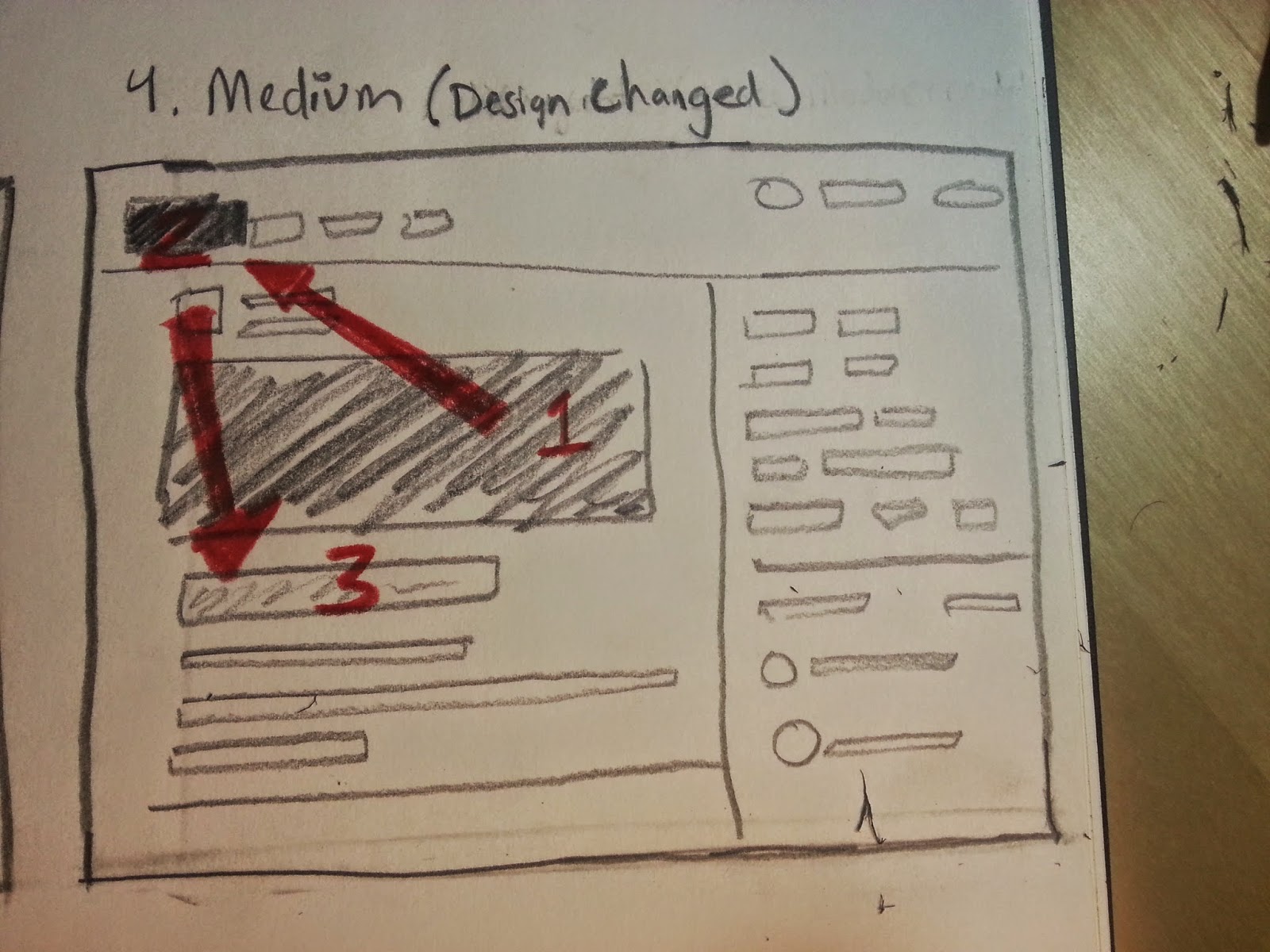


The densest area is the image associated with the top story, which is very good, following that, the user is drawn to the logo in the upper left (or the story headline, it was super close, I vacillated in choosing one or the other), and then to the story headline.  Overall, this is good visual hierarchy so far.  From the look of it, it seems optimized for mobile, and that's fine if that's the market it's trying to capture, although on the larger screen, it looks somewhat empty.  Not bad, just a bit empty.  There's sparse space everywhere on this page.  It's fine, it's very readable and easy on the eyes, it just doesn't evoke a newspaper, which is also fine, because many of the readers of this site, I suspect, have never actually held a newspaper in their hands, instead relying on ipads and mobile phones to get their news.  The site is designed to cater to the audience of the future.  Less content, in more easily digestible pieces.

3. Open your eyes and ask yourself "who is the user?"

A user that wants access to not the most important news, but rather, interesting news, fun reads.

4. What is the user's critical goal? (or at least what do you think the site owner wants them to do?)

Entertainment.  The site features articles written by amateur writers on virtually any topic, so users are looking for a light-hearted reading experience, and also, in the case of some users, a strongly emotional reading experience (some of the articles are written so as to get an emotional rise out of people and encourage many comments that will inevitably turn into long arguments between commenters).

5. Does the visual hierarchy you sketched lead to that goal?

It does.  The user can clearly see the main article, the user can then either scroll down to view other selected articles, or alternatively, can select articles from a keyword section on the right, so as to tailor the articles shown specifically to that particular user's tastes.  This is a very interesting feature, which I did not see during my brief exploration of the NYT or The Huffington Post's landing pages.  While those other two sites do have headings which the user can choose from, headings are different from keywords in that the headings are the traditional headings and remain fixed, say, entertainment, government, weather, etc., whereas the keywords are much more specific, such as "Google," "Social Justice," "Teaching," "NBA," etc., reflecting topics that may be trending at any particular moment in time.  This feature is fascinating to me, as I think it is a good way to capture the younger readership, who is used to customized content as opposed to the traditional newspaper sections.

6. What font families are most prominent on the site? (use the WhatFont add-on or your browser's developer tools to inspect this).

jaf - bernino - sans - regular

7. How do these font families contribute to or take away from the site's flow?

The site has an innovative flow, and the font families contribute to a cohesive aesthetic.  that said, a user can get lost on this site, as the structure is not hierarchical, as in the case of a newspaper.  Instead, it seems like there is really no beginning and no end to all the articles.  Younger users may be used to this, but older users may find it disorienting.  For Medium's business model, which involves user-created content, and the users are presumably younger, this could work just fine.

8. How do the line spacings, sizes, colors and weights contribute to or take away from the site's flow?

The line spacings, sizes, colors, and weights give the site a new media feel, as opposed to attempting to copy a newspaper.  The site is optimized for viewing on a screen, versus attempting to squeeze a newspaper onto a computer screen.

9. What would you improve to achieve a better hierarchy or flow?

Not much.  It's not what I'm used to in a news site, but I can see how it is optimized for a younger generation content with browsing endlessly in circles for hours and hours online.  It's the same story as Facebook, user-generated content with a free-flowing structure.

All right, I'm done with the 1st task, now I'm starting on task 2, design teardowns for the Facebook Home Page, News Feed, Profile, About, and Photos Page.

SUMMARY OF CODING SKILLS

Total Treehouse Points: 5,385

Treehouse Points by Subject Matter (Miscellaneous not included): 
HTML:                                663 
CSS:                                1,599 
Design:                            1,193 
Development Tools:            747 
Javascript:                      1,120

Treehouse Ranking (%): "You have more total points than 94% of all students."

Treehouse Badge(s) Earned Today:


Treehouse Courses Completed:
How to Make a Website
HTML
CSS Foundations
CSS Layout Techniques
Aesthetic Foundations
Design Foundations
Adobe Photoshop Foundations
Adobe Illustrator Foundations (66% complete, switched focus from web design to web dev)
Git Basics
Introduction to Programming
Javascript Basics

Codecademy (& other) Courses Completed:
HTML and CSS (Codecademy) 

Books Read or in Progress:

Completed: "Head First HTML and CSS," by E. Robson & E. Freeman
In Progress: "Eloquent JavaScript," by Marijn Haverbeke (On pg 27)
In Progress: "Head First Javascript," by Eric Freeman and Elisabeth Robson (On pg 56)
In Progress: "A Smarter Way to Learn Javascript," by Mark Myers (on pg 72)

My Progress on The Odin Project:
1.  Introduction to Web Development             100% Complete
2.  Web Development 101                                29% Complete
3.  Ruby Programming                                       0% Complete
4.  Ruby on Rails                                               0% Complete
5.  HTML5 and CSS3                                           0% Complete
6.  Javascript and JQuery                                  0% Complete
7.  Getting Hired as a Web Developer                 0% Complete

Hours Spent Coding Today:5
Total Hours Coding: 478

Thursday, April 23, 2015

Day 100: More UX and Design Teardowns

Woke up very early today, ready to get in a productive day.  Started the day by going over the design teardown video again, in order to refresh myself on design teardowns (as opposed to UX teardowns).  I'll be posting daily again instead of those very long, multi-day posts, as holding myself accountable on a daily basis boosts my productivity.  

As an aside, I bought a light alarm.  It's neat, it wakes me up gradually over the course of half an hour, by turning on a light at a dim intensity, then raising that intensity up over the course of the half hour before I am supposed to wake up, and then an alarm sounds at the desired time, just in case.  It has helped me a lot, because I close my blinds at night (to avoid light pollution from the street), so then in the morning, when the sun comes up, I don't really notice, and that's not good, because our bodies are made to rise with the sunrise.

The interesting part is that it actually works.  So, for example, I usually wake up before the alarm even sounds, and I wake up feeling great, it eases me out of my sleep instead of jarring me out of it like a typical alarm does.  This light alarm isn't really coding-related, per se, but in order to code, we've got to have our mind and body in tip-top shape, and this light alarm helps with that, so that's why i'm mentioning it.  I highly recommend getting one, even though they can be a bit pricey, for example, mine was around $75.  

That said, I don't really see the light alarm as a waste of money, I see it as an investment in myself, in the same vein as buying the ergonomic chair, the ergonomic and spacious desk, the laptop stand, the book stand for reading coding books, and the bright lamps, for having a nicely illuminated desktop, for example.  All of these purchases have aided me greatly in working towards my goal of becoming a web developer.  Before I bought the ergonomic chair, for example, I had a chair with no back support and a metal wal-mart chair which cut off the blood flow to my legs after 20 minutes or so, making me not want to sit down, but now, with this new chair which is perfect for tall people like me, I can actually sit for 8 or 10 hours (or more) straight if I need to without any discomfort.  This means I can focus on coding instead of on physical discomfort.

So yeah, that's just a few thoughts on investing in yourself.  Sometimes some of the things you get will not work out, and that's o.k., a couple of bucks will go to waste, but if you research the product enough and decide it could help you in achieving your goals, then you'll be right more often than not, and it'll pay off in increased productivity.

Today, Erik Trautman hosted an online presentation (via Google Hangout) in which he invited potential coding school applicants to ask any questions we may have about the program.  I submitted a couple of questions in case Erik could use a few extra to fill out the presentation.  To be honest, the only real question I have is:

"When can I start?"  

Hahaha!  Seriously though, I've got to keep up the momentum and get these modules knocked out.  They're actually pretty fun to go through, and I'm learning a lot.  Coding is cool.  

Oh, the hangout started!  There's a girl chatting with Eric, and I can see her in the video...I'm not sure if I am supposed to do video.  I thought it would be like a chat, I haven't used Google Hangout before.  Neat.

Ok, I figured out how to use it!  Next time, I'll look for the save chat history feature, I didn't know that the chat would not be saved without it.  Nonetheless, that was cool.  I found out that Erik's a mechanical engineer, and he's been coding since college.  That's pretty cool.  Oh, and he was in finance before going into coding as a career, which is cool because I was in finance too, when I worked as a stock broker.

Erik mentioned that two of the students from the first class now work for The Odin Project/The Viking Code School.  I think that's pretty neat.  I wonder if they work remotely or if they work from an awesome San Francisco office.  I'd consider moving to San Francisco...perhaps.  

Erik mentioned the Pomodoro technique and rescue time when i asked him about time management tools, so I'll look into them.

I love this.  Making the decision to code is making every day novel and exciting, as well as giving me an even happier outlook on the future than I already had to begin with.  

Good stuff.

SUMMARY OF CODING SKILLS

Total Treehouse Points: 5,385

Treehouse Points by Subject Matter (Miscellaneous not included): 
HTML:                                663 
CSS:                                1,599 
Design:                            1,193 
Development Tools:            747 
Javascript:                      1,120

Treehouse Ranking (%): "You have more total points than 94% of all students."

Treehouse Badge(s) Earned Today:


Treehouse Courses Completed:
How to Make a Website
HTML
CSS Foundations
CSS Layout Techniques
Aesthetic Foundations
Design Foundations
Adobe Photoshop Foundations
Adobe Illustrator Foundations (66% complete, switched focus from web design to web dev)
Git Basics
Introduction to Programming
Javascript Basics

Codecademy (& other) Courses Completed:
HTML and CSS (Codecademy) 

Books Read or in Progress:

Completed: "Head First HTML and CSS," by E. Robson & E. Freeman
In Progress: "Eloquent JavaScript," by Marijn Haverbeke (On pg 27)
In Progress: "Head First Javascript," by Eric Freeman and Elisabeth Robson (On pg 56)
In Progress: "A Smarter Way to Learn Javascript," by Mark Myers (on pg 72)

My Progress on The Odin Project:
1.  Introduction to Web Development             100% Complete
2.  Web Development 101                                29% Complete
3.  Ruby Programming                                       0% Complete
4.  Ruby on Rails                                               0% Complete
5.  HTML5 and CSS3                                           0% Complete
6.  Javascript and JQuery                                  0% Complete
7.  Getting Hired as a Web Developer                 0% Complete

Hours Spent Coding Today: 3
Total Hours Coding: 473

Wednesday, April 22, 2015

Assignment from Viking Code School Prep Work: Twitter, Airbnb, and Amazon UX Teardowns

This is my Viking Code School prep work UX teardown for twitter, airbnb, and amazon.  This post is different from my usual posts, as it is intended to be shared, unlike my other posts, which are more like personal notes.  As such, I won't include any of my coding stats on this post, but I'll go back to doing so after this post.  

One thing that was made plainly obvious while doing the UX teardowns of these three sites was that the design of these sites facilitates their key user's critical goal.  Another thing I noticed is that all three of these sites depend on user-generated content.  All three of these sites provide a platform that is then filled up by buyers and sellers, or in the case of twitter, by readers and writers.

These sites are very successful, they have been carefully designed to facilitate certain critical goals, leading to exponential growth rates.  Also, my first information architecture sketch was done with pencil and paper, but the second and third sketches were done using Balsamiq, which produced far more useful end results.

O.k., here goes!

Twitter UX Teardown

1. Who is the key user? This isn't always clear, especially in marketplace sites, so take your best guess.

People who enjoy consuming and creating microblog content.

2. What is that user's number one critical goal when using the site? Be as specific as possible if there are multiple options here, e.g. "to purchase a red wagon" instead of "buy a toy".

The user's goal is to consume and create microblog content. Twitter limits you to posts of 140 characters or less.

3. What is likely to make that user's experience particularly positive (i.e. provide good satisfaction)?

Easily being able to update content on a user's microblog and the ease with which the user can follow other users' microblogs.

4. What is the approximate information architecture of the site? (sketch it out)


Drawing that took a while and my desk is now covered in pieces of used up eraser, pencil shavings, and lead, haha.  I'm going to try using Balsamiq to do this for the next two UX teardowns, to see if that's faster, now that I know how to use that tool. 

5. What is the flow through that architecture for the user who is accomplishing the critical goal you identified above?

Once logged in, on the very first screen, the user can microblog (tweet) via a text entry box located on the center of the screen. It's very efficient.

6. What style(s) of navigation is/are used? Do they answer the two key questions (Where am I and how did I get here? Where should I go next and how do I get there?)?

A horizontal navigation bar is used. Twitter does let the user know where they are and how they got there, as the area of the navigation bar that you are currently in is marked by a blue underline, so you can't get lost. As far as where should I go next and how do I get there, the site focuses the user's attention on the twitter feed by having it centered on the screen and occupying the greater part of the screen's width. From there, the user's individual preferences will determine the path the user takes through the user generated content (or sponsored ads).

7. What key interactions does the user have? Are they clear and usable?

The user can make a tweet, send a message to another blogger, and explore the profiles of other bloggers. Making a tweet is straightforward.

8. What did the site do well to allow the user to accomplish his goal effectively, efficiently and with good satisfaction?

The site focuses on user's critical goal, microblogging, pretty much exclusively. The trends box gives users suggestions on what trending hashtags to follow, the main twitter feed gives users access to the content created by people the user is following and allows the user to create content, and the "who to follow" section on the right gives users suggestions on new people to follow. In sum, the site is all about microblogging, and does a great job at encouraging users to create and consume microblogging content.

9. What did the site do poorly when allowing the user to accomplish his goal effectively, efficiently and with good satisfaction?

The site has a help section for any questions you may have, but it's all in text. I think it would be nice if the site also had video walk-throughs, because those are fun to go through. Other than that, I don't really think it does much poorly.


Airbnb UX Teardown

1. Who is the key user? This isn't always clear, especially in marketplace sites, so take your best guess.

People who are looking for lodging during their travels.  People who are looking to post available lodging are also key users, because without sellers, there are no buyers, but the buyers vastly outnumber the sellers, so I chose to label buyers the key users.

2. What is that user's number one critical goal when using the site? Be as specific as possible if there are multiple options here, e.g. "to purchase a red wagon" instead of "buy a toy".

The user's goal is to book lodging.

3. What is likely to make that user's experience particularly positive (i.e. provide good satisfaction)?

A streamlined process with which to make the booking.

4. What is the approximate information architecture of the site? (sketch it out)


Well, I tried drafting the information architecture both ways, via pencil and paper and via Balsamiq, and Balsamiq is much better for visualizing information architecture.  I love Balsamiq!

5. What is the flow through that architecture for the user who is accomplishing the critical goal you identified above?

Enter location desired, enter arrival date, enter departure date, select number of guests, click on the search button, click on the lodging desired, and then book the lodging (the process then varies from there depending on if the user already has an account or not).

6. What style(s) of navigation is/are used? Do they answer the two key questions (Where am I and how did I get here? Where should I go next and how do I get there?)?

There are two horizontal navigation bars on top, one of which only appears when the user scrolls down far enough, but the site is so streamlined that it is virtually impossible for a user to get lost.  The user is guided every step of the way in a very intuitive manner towards the end goal, booking lodging.  In addition to the architecture being extremely efficient, the site is also aesthetically pleasing.  O.k., that's an understatement, the site is downright elegant, it has a minimalist beauty to it.

7. What key interactions does the user have? Are they clear and usable?

The user is able to search for lodging via a combination of google maps and images of the specific bedrooms/apartments/houses available.  This system is very clear and very usable, it's fantastic.  

8. What did the site do well to allow the user to accomplish his goal effectively, efficiently and with good satisfaction?

The site focuses on the user's critical goal, finding lodging, in a way that makes the search for lodging itself a pleasant experience.  In the past, searching for a hotel involved calling many hotels, jotting down details for comparison, and then crossing one's fingers that what was advertised was what was delivered.  Now, with airbnb's model, what used to be a somewhat tedious process has been turned into an amazing experience.  It's beautiful to behold.

9. What did the site do poorly when allowing the user to accomplish his goal effectively, efficiently and with good satisfaction?

The only thing I can think of, if forced to answer this from the viewpoint of a user, is that the site is amazing, but it is still not a popular service in some parts of the world, so the search function will return sparse offerings in those locations, which is not good.  It would be great if airbnb would promote itself in places where it has not made inroads yet.  So, for example, there are mid-size cities around the globe where there are plenty of hotel offerings, but few or no airbnb offerings because landowners in those areas simply haven't been exposed to airbnb yet.  As airbnb grows and grows, this will change, but for now, there are still areas where airbnb pickings are sparse and travelers still have to deal with hotels.  That said, from the viewpoint of a business owner, not promoting airbnb in these mid-size or smaller cities may be the better business decision for now, allowing growth to happen via word of mouth, so it's understandable.


Amazon UX Teardown

1. Who is the key user? This isn't always clear, especially in marketplace sites, so take your best guess.

Buyers of consumer goods.  Sellers are also key users, as without the sellers, there can be no buyers, but as the case with airbnb, buyers vastly outnumber sellers, so I chose to label buyers as the key users.

2. What is that user's number one critical goal when using the site? Be as specific as possible if there are multiple options here, e.g. "to purchase a red wagon" instead of "buy a toy".

The key user's goal is to purchase consumer goods.  

3. What is likely to make that user's experience particularly positive (i.e. provide good satisfaction)?

Easily being able to find desired goods to buy. 

4. What is the approximate information architecture of the site? (sketch it out)


I love Balsamiq.  It's easy to work with, and I can see how, whenever you are going to create a web application, you've got to mockup both the information architecture and the site itself before writing your first line of code, to lay the groundwork for completing a project efficiently.

5. What is the flow through that architecture for the user who is accomplishing the critical goal you identified above?  

Once logged in, on the very first screen, the user can enter the name of the desired product in the search bar on the top of the screen, which takes up most of the space on the navigation bar.  Once the name is entered, the user clicks on the search button (a magnification glass icon) and a list of results sorted by relevance appears below the search bar.  To the left of the search bar, the users is shown various options that can be used to further filter the search results.  To the right of the search bar, the user is sometimes (depending on the product category) shown sponsored ads for products that are also relevant to the search criteria entered.

6. What style(s) of navigation is/are used? Do they answer the two key questions (Where am I and how did I get here? Where should I go next and how do I get there?)?

A horizontal navigation bar is used, but the main feature is the search bar, which facilitates the user's key goal, finding a desired consumer good to purchase.  It's hard for the user to get lost, because the search bar itself is the primary way to navigate the site, and as the search bar is easy to find, navigation is a breeze.  This is excellent, as the design of the site is completely in sync with the key user's goals.

7. What key interactions does the user have? Are they clear and usable?

The user can search for a product, be given a list of results, and can then interact with those results in many ways, by viewing images of the product, viewing product reviews, and finally, making a purchase.  The interactions are very clear and usable, the site is well made and uses every inch of its real estate to advance the key user's goal.

8. What did the site do well to allow the user to accomplish his goal effectively, efficiently and with good satisfaction?

The site focuses on the critical user goal, making the search bar very large and using good search algorithms to display highly relevant goods to the user.  Then, the site has a review system which allows the user to judge a product, after which, if desired, the user can then walk through the very streamlined purchasing process.

9. What did the site do poorly when allowing the user to accomplish his goal effectively, efficiently and with good satisfaction?

The ads can be a distraction if a user is just trying to get in and get out, but in Amazon's defense, the ads are usually relevant to the search, and also, many shoppers are not looking for an efficient experience, instead enjoying meandering through the product selection, taking their time to compare goods before selecting the good to purchase.  Amazon does a fair job of catering to both buyers who prefer a direct, efficient process and those who prefer to meander about and take their time.