All right, it's 3:30 a.m. I got a good 6.5 hours of sleep in, and I normally prefer 8, but I feel well rested, so I'm waking up early to get a lot of work done! Here's an outline of the tasks I'm working on:
1. Design teardowns for NY Times, TMZ, The Huffington Post, and Medium.
2. Design teardowns for the Facebook Home Page, News Feed, Profile, About, and Photos Page.
3. Balsamiq Mockups for Facebook Home Page, News Feed, Profile, About, and Photos Page. This includes visual hierarchy sketches or mockups for Facebook Home Page, News Feed, Profile, About, and Photos Page.
4. Upload # 2 and # 3 to Github
Design Teardowns for NY Times, TMZ, The Huffington post, and Medium
New York Times Design Teardown
1. Go to each of the sites below and immediately squint your eyes so you can't really see what they say.
2. Sketch on a sheet of paper what the approximate visual hierarchy looks like -- what areas are denser and what areas are more sparse?
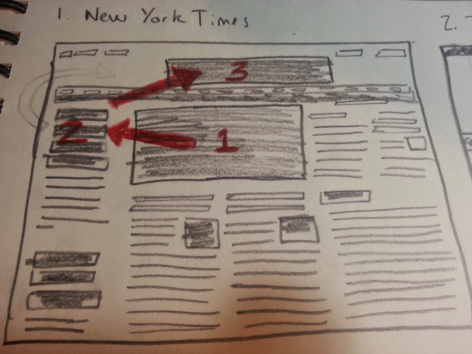
The main image is the most dense part, to the left of that is the heading for the main image, and then after that, the eye is drawn to the New York Times logo/heading..
3. Open your eyes and ask yourself "who is the user?"
Someone who is interested in keeping up with important news, with a New York Times slant to it.
4. What is the user's critical goal? (or at least what do you think the site owner wants them to do?)
Reading the most important news, as filtered by the New York Times.
5. Does the visual hierarchy you sketched lead to that goal?
Yes. The most important story has a picture next to it which gives an idea of what the story is about, and then the story's title is in a large font.
6. What font families are most prominent on the site? (use the WhatFont add-on or your browser's developer tools to inspect this).
nyt-cheltenham-bold, nyt-franklin-regular, nyt-georgia-regular, and nyt-karnak-display-130124-regular.
7. How do these font families contribute to or take away from the site's flow?
The size of the font and the boldness of it or lack thereof guide the user visually towards the stories the NYT wants to highlight. The fonts go well with each other, except for karnak, but perhaps that is intentional. I mention that because that section highlights links to other stories, some of which take the user outside of the NYT website, so using karnak, very different from the other fonts, may have been used to imply the difference between the "Watching" section of the main page and the rest of the main page.
8. How do the line spacings, sizes, colors and weights contribute to or take away from the site's flow?
They give the site an aesthetic cohesiveness, create high readability, and highlight desired stories/sections. The site has a nice flow, it puts the reader at ease and conveys legitimacy.
9. What would you improve to achieve a better hierarchy or flow?
I would remove the "Watching" section. That section provides links to news from a couple of minutes ago, in a continuously updating feed. The thing with that is that that's what twitter and similar sites are for. The NYT, if I go to their site, I don't want, let's call it, "yelping chihuahua news," I want, "distinguished great dane" news, if that makes any sense. In other words, Twitter and similar sites are for raw snippets of news coming from many unpolished sources. On the other hand, from the New York Times, I expect a finished product, and I am o.k. with waiting a week or so to get it, so that the story has been fleshed out more fully.
TMZ Design Teardown
1. Go to each of the sites below and immediately squint your eyes so you can't really see what they say.
2. Sketch on a sheet of paper what the approximate visual hierarchy looks like -- what areas are denser and what areas are more sparse?
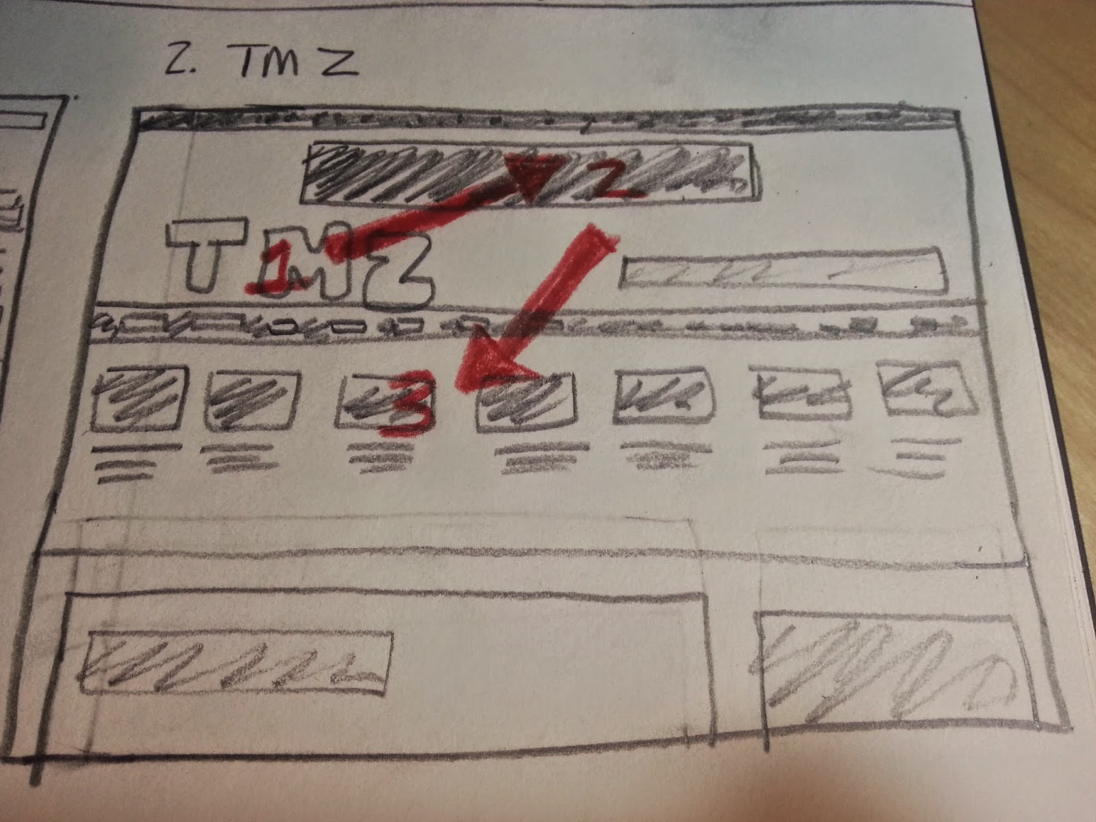
The logo is the most dense, followed by the ad on top, and then the images below the logo. Not too much is sparse, there's a lot of things going on in the page, perhaps too many things.
3. Open your eyes and ask yourself "who is the user?"
People that like to read about celebrity gossip.
4. What is the user's critical goal? (or at least what do you think the site owner wants them to do?)
Reading the latest and most important celebrity gossip.
5. Does the visual hierarchy you sketched lead to that goal?
No. The visual hierarchy leads to the logo, then to a large banner ad, then to many different images linking to lots of celebrity gossip stories. The most important celebrity gossip story is almost an afterthought at the bottom of the page, which, if the user's viewport is not large enough, the user will have to scroll down to see it. That's not good as the most important story should be "above the fold."
6. What font families are most prominent on the site? (use the WhatFont add-on or your browser's developer tools to inspect this).
Sans Pro - regular and Sans Pro - 600.
7. How do these font families contribute to or take away from the site's flow?
Using the same font family does give the site consistency. The flow is somewhat scatter-brained, though, there's just too many things trying to get my attention, and the ads are competing with the content.
8. How do the line spacings, sizes, colors and weights contribute to or take away from the site's flow?
They attempt to convey to the user what is important, but since that means the important items are the large logo on the upper left and the banner ad on top, I don't think the spacings, sizes, colors, and weights help the user achieve their critical goal efficiently.
9. What would you improve to achieve a better hierarchy or flow?
I would completely redesign this website. It does not have a clean look, there's simply too much going on, and there's a lot of space that could be used more efficiently. I'm not a fan of this site's design. I mean, it works, I just think it could be improved upon substantially. I would remove the banner ad on top and I would not have an image next to every one of the stories above the main story. Instead, I would move the main story up on the page, above the fold, and then move all the smaller stories below the main story, with or with out pictures for the smaller stories (probably without, but if TMZ's readers really, really like pictures, then including a picture with every story, even the smaller ones, could make sense).
Huffington Post Design Teardown
1. Go to each of the sites below and immediately squint your eyes so you can't really see what they say.
2. Sketch on a sheet of paper what the approximate visual hierarchy looks like -- what areas are denser and what areas are more sparse?
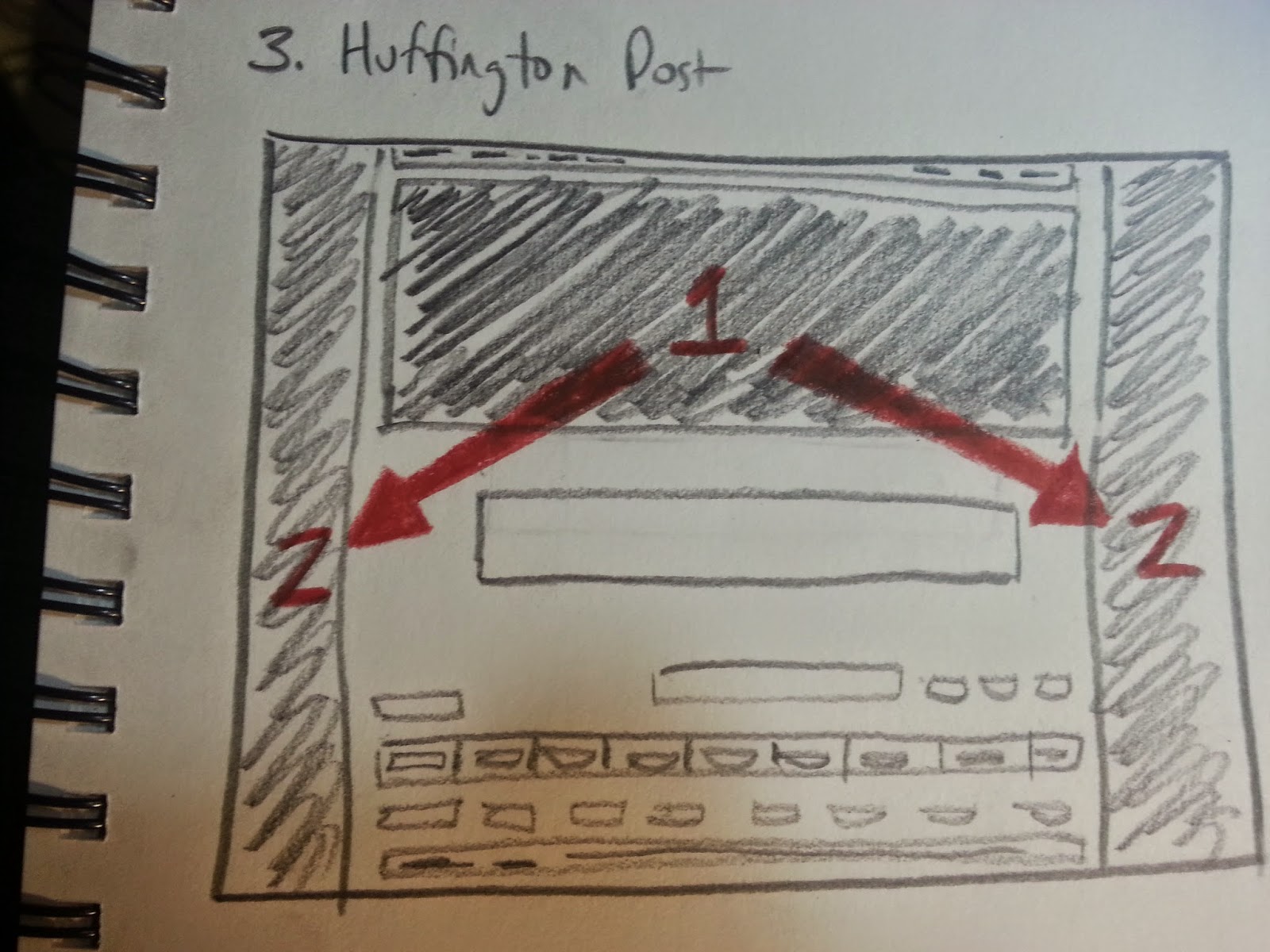
The densest areas are areas 1 and 2, where the ads are. The more sparse areas are below, where the news should be, but where there is primarily white space.
3. Open your eyes and ask yourself "who is the user?"
People that want to read the most important news, with a Huffington Post vibe to it.
4. What is the user's critical goal? (or at least what do you think the site owner wants them to do?)
Reading the most important news, as filtered by the Huffington Post.
5. Does the visual hierarchy you sketched lead to that goal?
Absolutely not. The visual hierarchy leads the user to a giant ad at the top and very loud (visually speaking) ads on the right and left borders of the page. It is hard to find any news at all on this page. The main story is below the fold and only a part of the main story's headline is visible above the fold.
6. What font families are most prominent on the site? (use the WhatFont add-on or your browser's developer tools to inspect this).
Arial, Arial - bold, serif - regular, Georgia, and OpenSansCondensed.
7. How do these font families contribute to or take away from the site's flow?
They do go well with each other, contributing to the flow, but they are simply overshadowed by the ads. The may not even get to the fonts before he closes out the page to escape from the gigantic ads.
8. How do the line spacings, sizes, colors and weights contribute to or take away from the site's flow?
The combination of line spacings, sizes, colors, and weights is aesthetically pleasing, except that the ads completely overshadow the entire experience, making all the work put into the actual displaying of the news a moot point.
9. What would you improve to achieve a better hierarchy or flow?
I would make the ad on top vertically smaller, or better yet, remove it entirely, so as to move the main story above the fold. Inserting ads discretely may serve the newspaper's business better in the long run. I would focus on the news. People come to this site to read the news, not to see ads, and the user's critical goal should be reflected in the design of the site. If it is hard to get to the actual news, I don't think people will return frequently, which means the newspaper will not be able to get as much for placing ads, which means the quality of the newspaper's content will go down due to decreased funds available for hiring journalists, leading to a loss in readership, leading to lower market values for ads, leading to less funds available to hire journalists, and so on and so forth.
Medium Design Teardown
1. Go to each of the sites below and immediately squint your eyes so you can't really see what they say.
2. Sketch on a sheet of paper what the approximate visual hierarchy looks like -- what areas are denser and what areas are more sparse?
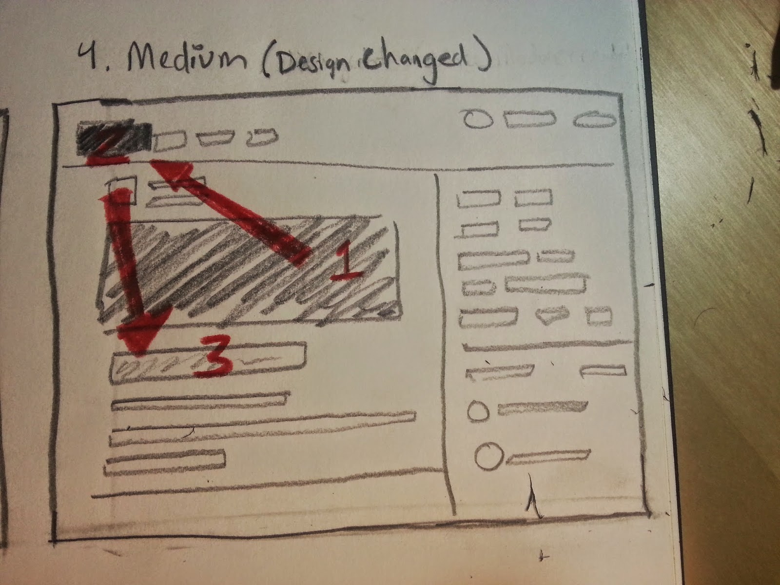
The densest area is the image associated with the top story, which is very good, following that, the user is drawn to the logo in the upper left (or the story headline, it was super close, I vacillated in choosing one or the other), and then to the story headline. Overall, this is good visual hierarchy so far. From the look of it, it seems optimized for mobile, and that's fine if that's the market it's trying to capture, although on the larger screen, it looks somewhat empty. Not bad, just a bit empty. There's sparse space everywhere on this page. It's fine, it's very readable and easy on the eyes, it just doesn't evoke a newspaper, which is also fine, because many of the readers of this site, I suspect, have never actually held a newspaper in their hands, instead relying on ipads and mobile phones to get their news. The site is designed to cater to the audience of the future. Less content, in more easily digestible pieces.
3. Open your eyes and ask yourself "who is the user?"
A user that wants access to not the most important news, but rather, interesting news, fun reads.
4. What is the user's critical goal? (or at least what do you think the site owner wants them to do?)
Entertainment. The site features articles written by amateur writers on virtually any topic, so users are looking for a light-hearted reading experience, and also, in the case of some users, a strongly emotional reading experience (some of the articles are written so as to get an emotional rise out of people and encourage many comments that will inevitably turn into long arguments between commenters).
5. Does the visual hierarchy you sketched lead to that goal?
It does. The user can clearly see the main article, the user can then either scroll down to view other selected articles, or alternatively, can select articles from a keyword section on the right, so as to tailor the articles shown specifically to that particular user's tastes. This is a very interesting feature, which I did not see during my brief exploration of the NYT or The Huffington Post's landing pages. While those other two sites do have headings which the user can choose from, headings are different from keywords in that the headings are the traditional headings and remain fixed, say, entertainment, government, weather, etc., whereas the keywords are much more specific, such as "Google," "Social Justice," "Teaching," "NBA," etc., reflecting topics that may be trending at any particular moment in time. This feature is fascinating to me, as I think it is a good way to capture the younger readership, who is used to customized content as opposed to the traditional newspaper sections.
6. What font families are most prominent on the site? (use the WhatFont add-on or your browser's developer tools to inspect this).
jaf - bernino - sans - regular
7. How do these font families contribute to or take away from the site's flow?
The site has an innovative flow, and the font families contribute to a cohesive aesthetic. that said, a user can get lost on this site, as the structure is not hierarchical, as in the case of a newspaper. Instead, it seems like there is really no beginning and no end to all the articles. Younger users may be used to this, but older users may find it disorienting. For Medium's business model, which involves user-created content, and the users are presumably younger, this could work just fine.
8. How do the line spacings, sizes, colors and weights contribute to or take away from the site's flow?
The line spacings, sizes, colors, and weights give the site a new media feel, as opposed to attempting to copy a newspaper. The site is optimized for viewing on a screen, versus attempting to squeeze a newspaper onto a computer screen.
9. What would you improve to achieve a better hierarchy or flow?
Not much. It's not what I'm used to in a news site, but I can see how it is optimized for a younger generation content with browsing endlessly in circles for hours and hours online. It's the same story as Facebook, user-generated content with a free-flowing structure.
All right, I'm done with the 1st task, now I'm starting on task 2, design teardowns for the Facebook Home Page, News Feed, Profile, About, and Photos Page.
SUMMARY OF CODING SKILLS
1. Design teardowns for NY Times, TMZ, The Huffington Post, and Medium.
2. Design teardowns for the Facebook Home Page, News Feed, Profile, About, and Photos Page.
3. Balsamiq Mockups for Facebook Home Page, News Feed, Profile, About, and Photos Page. This includes visual hierarchy sketches or mockups for Facebook Home Page, News Feed, Profile, About, and Photos Page.
4. Upload # 2 and # 3 to Github
Design Teardowns for NY Times, TMZ, The Huffington post, and Medium
New York Times Design Teardown
1. Go to each of the sites below and immediately squint your eyes so you can't really see what they say.
2. Sketch on a sheet of paper what the approximate visual hierarchy looks like -- what areas are denser and what areas are more sparse?

The main image is the most dense part, to the left of that is the heading for the main image, and then after that, the eye is drawn to the New York Times logo/heading..
3. Open your eyes and ask yourself "who is the user?"
Someone who is interested in keeping up with important news, with a New York Times slant to it.
4. What is the user's critical goal? (or at least what do you think the site owner wants them to do?)
Reading the most important news, as filtered by the New York Times.
5. Does the visual hierarchy you sketched lead to that goal?
Yes. The most important story has a picture next to it which gives an idea of what the story is about, and then the story's title is in a large font.
6. What font families are most prominent on the site? (use the WhatFont add-on or your browser's developer tools to inspect this).
nyt-cheltenham-bold, nyt-franklin-regular, nyt-georgia-regular, and nyt-karnak-display-130124-regular.
7. How do these font families contribute to or take away from the site's flow?
The size of the font and the boldness of it or lack thereof guide the user visually towards the stories the NYT wants to highlight. The fonts go well with each other, except for karnak, but perhaps that is intentional. I mention that because that section highlights links to other stories, some of which take the user outside of the NYT website, so using karnak, very different from the other fonts, may have been used to imply the difference between the "Watching" section of the main page and the rest of the main page.
8. How do the line spacings, sizes, colors and weights contribute to or take away from the site's flow?
They give the site an aesthetic cohesiveness, create high readability, and highlight desired stories/sections. The site has a nice flow, it puts the reader at ease and conveys legitimacy.
9. What would you improve to achieve a better hierarchy or flow?
I would remove the "Watching" section. That section provides links to news from a couple of minutes ago, in a continuously updating feed. The thing with that is that that's what twitter and similar sites are for. The NYT, if I go to their site, I don't want, let's call it, "yelping chihuahua news," I want, "distinguished great dane" news, if that makes any sense. In other words, Twitter and similar sites are for raw snippets of news coming from many unpolished sources. On the other hand, from the New York Times, I expect a finished product, and I am o.k. with waiting a week or so to get it, so that the story has been fleshed out more fully.
TMZ Design Teardown
1. Go to each of the sites below and immediately squint your eyes so you can't really see what they say.
2. Sketch on a sheet of paper what the approximate visual hierarchy looks like -- what areas are denser and what areas are more sparse?

The logo is the most dense, followed by the ad on top, and then the images below the logo. Not too much is sparse, there's a lot of things going on in the page, perhaps too many things.
3. Open your eyes and ask yourself "who is the user?"
People that like to read about celebrity gossip.
4. What is the user's critical goal? (or at least what do you think the site owner wants them to do?)
Reading the latest and most important celebrity gossip.
5. Does the visual hierarchy you sketched lead to that goal?
No. The visual hierarchy leads to the logo, then to a large banner ad, then to many different images linking to lots of celebrity gossip stories. The most important celebrity gossip story is almost an afterthought at the bottom of the page, which, if the user's viewport is not large enough, the user will have to scroll down to see it. That's not good as the most important story should be "above the fold."
6. What font families are most prominent on the site? (use the WhatFont add-on or your browser's developer tools to inspect this).
Sans Pro - regular and Sans Pro - 600.
7. How do these font families contribute to or take away from the site's flow?
Using the same font family does give the site consistency. The flow is somewhat scatter-brained, though, there's just too many things trying to get my attention, and the ads are competing with the content.
8. How do the line spacings, sizes, colors and weights contribute to or take away from the site's flow?
They attempt to convey to the user what is important, but since that means the important items are the large logo on the upper left and the banner ad on top, I don't think the spacings, sizes, colors, and weights help the user achieve their critical goal efficiently.
9. What would you improve to achieve a better hierarchy or flow?
I would completely redesign this website. It does not have a clean look, there's simply too much going on, and there's a lot of space that could be used more efficiently. I'm not a fan of this site's design. I mean, it works, I just think it could be improved upon substantially. I would remove the banner ad on top and I would not have an image next to every one of the stories above the main story. Instead, I would move the main story up on the page, above the fold, and then move all the smaller stories below the main story, with or with out pictures for the smaller stories (probably without, but if TMZ's readers really, really like pictures, then including a picture with every story, even the smaller ones, could make sense).
Huffington Post Design Teardown
1. Go to each of the sites below and immediately squint your eyes so you can't really see what they say.
2. Sketch on a sheet of paper what the approximate visual hierarchy looks like -- what areas are denser and what areas are more sparse?

The densest areas are areas 1 and 2, where the ads are. The more sparse areas are below, where the news should be, but where there is primarily white space.
3. Open your eyes and ask yourself "who is the user?"
People that want to read the most important news, with a Huffington Post vibe to it.
4. What is the user's critical goal? (or at least what do you think the site owner wants them to do?)
Reading the most important news, as filtered by the Huffington Post.
5. Does the visual hierarchy you sketched lead to that goal?
Absolutely not. The visual hierarchy leads the user to a giant ad at the top and very loud (visually speaking) ads on the right and left borders of the page. It is hard to find any news at all on this page. The main story is below the fold and only a part of the main story's headline is visible above the fold.
6. What font families are most prominent on the site? (use the WhatFont add-on or your browser's developer tools to inspect this).
Arial, Arial - bold, serif - regular, Georgia, and OpenSansCondensed.
7. How do these font families contribute to or take away from the site's flow?
They do go well with each other, contributing to the flow, but they are simply overshadowed by the ads. The may not even get to the fonts before he closes out the page to escape from the gigantic ads.
8. How do the line spacings, sizes, colors and weights contribute to or take away from the site's flow?
The combination of line spacings, sizes, colors, and weights is aesthetically pleasing, except that the ads completely overshadow the entire experience, making all the work put into the actual displaying of the news a moot point.
9. What would you improve to achieve a better hierarchy or flow?
I would make the ad on top vertically smaller, or better yet, remove it entirely, so as to move the main story above the fold. Inserting ads discretely may serve the newspaper's business better in the long run. I would focus on the news. People come to this site to read the news, not to see ads, and the user's critical goal should be reflected in the design of the site. If it is hard to get to the actual news, I don't think people will return frequently, which means the newspaper will not be able to get as much for placing ads, which means the quality of the newspaper's content will go down due to decreased funds available for hiring journalists, leading to a loss in readership, leading to lower market values for ads, leading to less funds available to hire journalists, and so on and so forth.
Medium Design Teardown
1. Go to each of the sites below and immediately squint your eyes so you can't really see what they say.
2. Sketch on a sheet of paper what the approximate visual hierarchy looks like -- what areas are denser and what areas are more sparse?

The densest area is the image associated with the top story, which is very good, following that, the user is drawn to the logo in the upper left (or the story headline, it was super close, I vacillated in choosing one or the other), and then to the story headline. Overall, this is good visual hierarchy so far. From the look of it, it seems optimized for mobile, and that's fine if that's the market it's trying to capture, although on the larger screen, it looks somewhat empty. Not bad, just a bit empty. There's sparse space everywhere on this page. It's fine, it's very readable and easy on the eyes, it just doesn't evoke a newspaper, which is also fine, because many of the readers of this site, I suspect, have never actually held a newspaper in their hands, instead relying on ipads and mobile phones to get their news. The site is designed to cater to the audience of the future. Less content, in more easily digestible pieces.
3. Open your eyes and ask yourself "who is the user?"
A user that wants access to not the most important news, but rather, interesting news, fun reads.
4. What is the user's critical goal? (or at least what do you think the site owner wants them to do?)
Entertainment. The site features articles written by amateur writers on virtually any topic, so users are looking for a light-hearted reading experience, and also, in the case of some users, a strongly emotional reading experience (some of the articles are written so as to get an emotional rise out of people and encourage many comments that will inevitably turn into long arguments between commenters).
5. Does the visual hierarchy you sketched lead to that goal?
It does. The user can clearly see the main article, the user can then either scroll down to view other selected articles, or alternatively, can select articles from a keyword section on the right, so as to tailor the articles shown specifically to that particular user's tastes. This is a very interesting feature, which I did not see during my brief exploration of the NYT or The Huffington Post's landing pages. While those other two sites do have headings which the user can choose from, headings are different from keywords in that the headings are the traditional headings and remain fixed, say, entertainment, government, weather, etc., whereas the keywords are much more specific, such as "Google," "Social Justice," "Teaching," "NBA," etc., reflecting topics that may be trending at any particular moment in time. This feature is fascinating to me, as I think it is a good way to capture the younger readership, who is used to customized content as opposed to the traditional newspaper sections.
6. What font families are most prominent on the site? (use the WhatFont add-on or your browser's developer tools to inspect this).
jaf - bernino - sans - regular
7. How do these font families contribute to or take away from the site's flow?
The site has an innovative flow, and the font families contribute to a cohesive aesthetic. that said, a user can get lost on this site, as the structure is not hierarchical, as in the case of a newspaper. Instead, it seems like there is really no beginning and no end to all the articles. Younger users may be used to this, but older users may find it disorienting. For Medium's business model, which involves user-created content, and the users are presumably younger, this could work just fine.
8. How do the line spacings, sizes, colors and weights contribute to or take away from the site's flow?
The line spacings, sizes, colors, and weights give the site a new media feel, as opposed to attempting to copy a newspaper. The site is optimized for viewing on a screen, versus attempting to squeeze a newspaper onto a computer screen.
9. What would you improve to achieve a better hierarchy or flow?
Not much. It's not what I'm used to in a news site, but I can see how it is optimized for a younger generation content with browsing endlessly in circles for hours and hours online. It's the same story as Facebook, user-generated content with a free-flowing structure.
All right, I'm done with the 1st task, now I'm starting on task 2, design teardowns for the Facebook Home Page, News Feed, Profile, About, and Photos Page.
SUMMARY OF CODING SKILLS
Total Treehouse Points: 5,385
Treehouse Points by Subject Matter (Miscellaneous not included):
HTML: 663
CSS: 1,599
Design: 1,193
Development Tools: 747
Javascript: 1,120
Treehouse Ranking (%): "You have more total points than 94% of all students."
Treehouse Badge(s) Earned Today:
Treehouse Courses Completed:
How to Make a Website
HTML
CSS Foundations
CSS Layout Techniques
Aesthetic Foundations
Design Foundations
Adobe Photoshop Foundations
Adobe Illustrator Foundations (66% complete, switched focus from web design to web dev)
Git Basics
Introduction to Programming
Javascript Basics
Codecademy (& other) Courses Completed:
HTML and CSS (Codecademy)
Design Foundations
Adobe Photoshop Foundations
Adobe Illustrator Foundations (66% complete, switched focus from web design to web dev)
Git Basics
Introduction to Programming
Javascript Basics
Codecademy (& other) Courses Completed:
HTML and CSS (Codecademy)
Books Read or in Progress:
Completed: "Head First HTML and CSS," by E. Robson & E. Freeman
In Progress: "Eloquent JavaScript," by Marijn Haverbeke (On pg 27)
In Progress: "Head First Javascript," by Eric Freeman and Elisabeth Robson (On pg 56)
In Progress: "A Smarter Way to Learn Javascript," by Mark Myers (on pg 72)
My Progress on The Odin Project:
1. Introduction to Web Development 100% Complete
2. Web Development 101 29% Complete
3. Ruby Programming 0% Complete
4. Ruby on Rails 0% Complete
5. HTML5 and CSS3 0% Complete
6. Javascript and JQuery 0% Complete
7. Getting Hired as a Web Developer 0% Complete
Hours Spent Coding Today:5
Total Hours Coding: 478
No comments:
Post a Comment